 NIPPON84
6050826
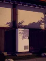
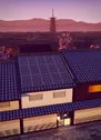
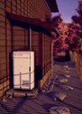
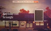
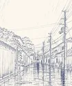
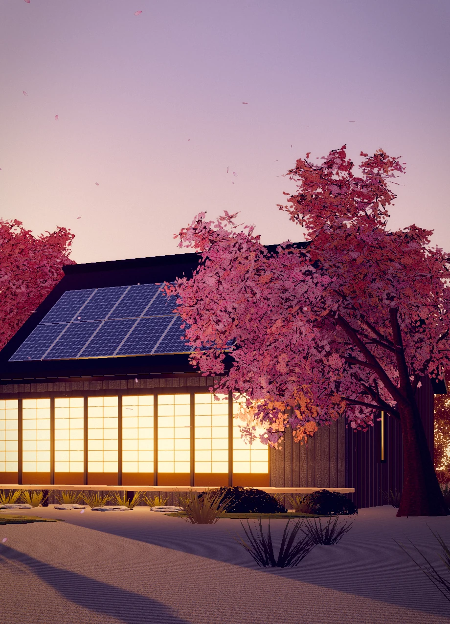
Our machiya is a hundred and ten years old. The crew laid the panels into the kawara as if they had always been there.

Haru MorimotoHigashiyama, Kyoto
Naka plan · 4.8 kW · on since April
How Sunseto looks, sounds and moves: the mark,the colours, the type, the grid and every crafteddetail of the site, in one place.
Ten chapters, from the mark to the last hairline. Everything shown here is built from the site’s own source and runs live on this page.
The mark, lockups, clear space and misuse→
Paper, ink, vermilion and the sunset print→
Four open fonts and the scale they are set in→
Three columns, hairline rules and 3:4 tiles→
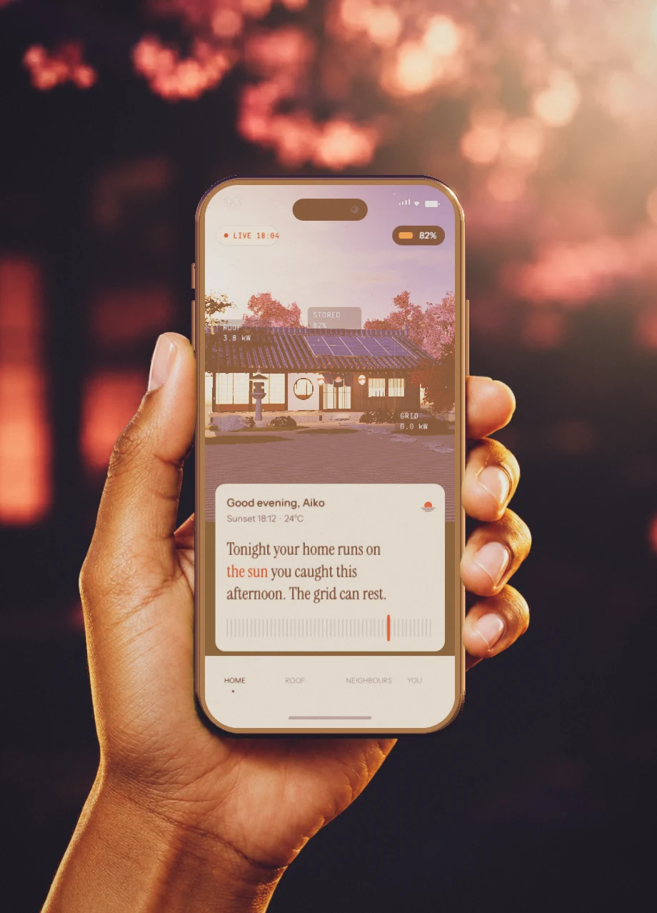
The parts of the site, working→
Engravings, ornaments, stamps and 3D tiles→
Easing, timing and four signature moves→
UK English, plain and warm→
The rules we always keep→
Every file, with its size→
Edition 01, September 2026. Set in Instrument Serif, Instrument Sans, JetBrains Mono and Shippori Mincho on washi, #fff7e9.
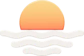
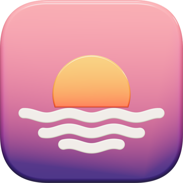
The Sunseto mark is a low sun meeting three waves. It stands for the one promise we make: the afternoon’s light, kept for the evening.
 1Mark
2Wordmark
3Seal
Baseline
x-height
1Mark
2Wordmark
3Seal
Baseline
x-height

Measure the width of the sun disc and keep that much clear paper on every side of the lockup. Nothing else enters that frame: no rules, no type, no edge of the screen.
Washi · #fff7e9Kinari · #f0e5cfFuji · #b9cbf1 Night · #1c1428The sunset print, above the sun
 On an engraving, in its sky

The enamel mark lives inside the lockups and the app icon. At favicon size, in print and in single colours, use the flat SVG in one of the four colourways.
The seal signs things: the lockup, a postcard, the chart paper, the Step 1 heading. It is always pressed at a slight turn and multiplied into the paper. It never stands in for the logo.
Most of Sunseto is washi and brown ink. Vermilion is the sun: it appears once or twice a screen, never as a wash. When colour is the point, the sunset print carries it.
The page itself. Every section sits on it until night falls.
Cards, plates and the chosen tier. One step down from the page.
Hairlines only: the grid, ledger rows, tier borders. Never text.
The ledger’s ink: headings, figures and notes on paper.
Body text, the black button and the nav’s ink.
Mono eyebrows, labels and captions.
The sun in the mark, the slider’s thumb, one accent per view.
Wisteria: the evening sky behind the call to action.
Navy type on the wisteria sky.
A handful of inks appear inside drawings, stamps and charts. They are named for the traditional pigments they resemble and used only where they are listed, never as fills for UI.
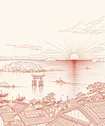
A woodblock sunset: a low sun cut by the horizon, flat kasumi bands, violet water in fine strokes, a paper grain over all of it. Three inks change per use; gold and orange stay.
Contrast is measured live on this page (WCAG 2.2). Text pairs pass AA at the sizes we set them; vermilion and the rule colour are for marks and lines, not reading.
Instrument Serif carries the feeling and Instrument Sans carries the facts. JetBrains Mono labels things, and Shippori Mincho sets the few kanji we use. All four are open fonts under the SIL OFL 1.1.
Our lamps never flickered, so the neighbours came round for tea.
No text on a Sunseto page renders below 11px, on any screen. Fluid sizes are wrapped in max(11px, …), and text inside SVGs is sized for the box it is drawn into: the postmark’s 8.5 units become 11.1px.
The struck-out samples are drawn larger here so this page keeps its own rule.
Every Sunseto page sits on three equal columns divided by 1px rules, with 20px of margin at the edge of the screen. Cells are 3:4, so a row of three is exactly four-ninths of the width tall.
The figures on the left are read from your browser as you resize it. Rows are set in container units, calc(100cqw * 4 / 9), so a tile stays 3:4 at any width.
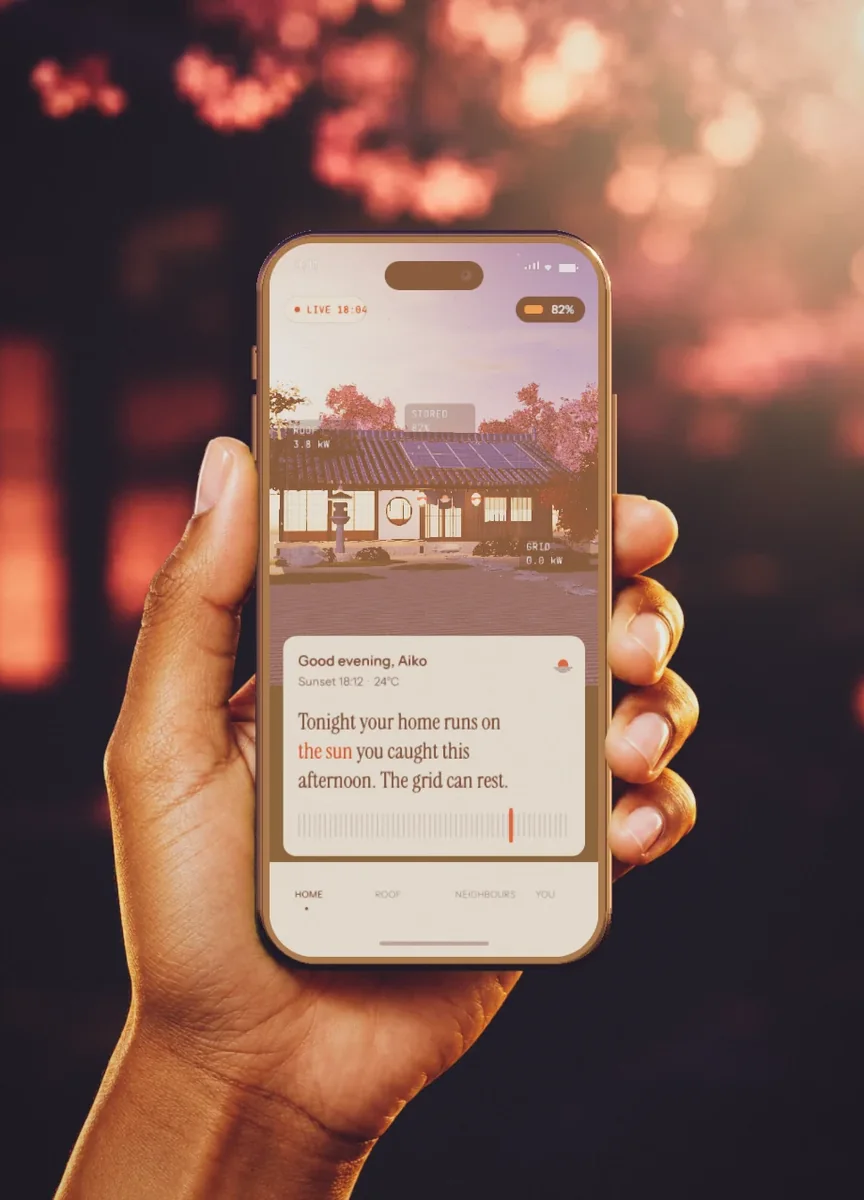
Homes · 3 rows of 3
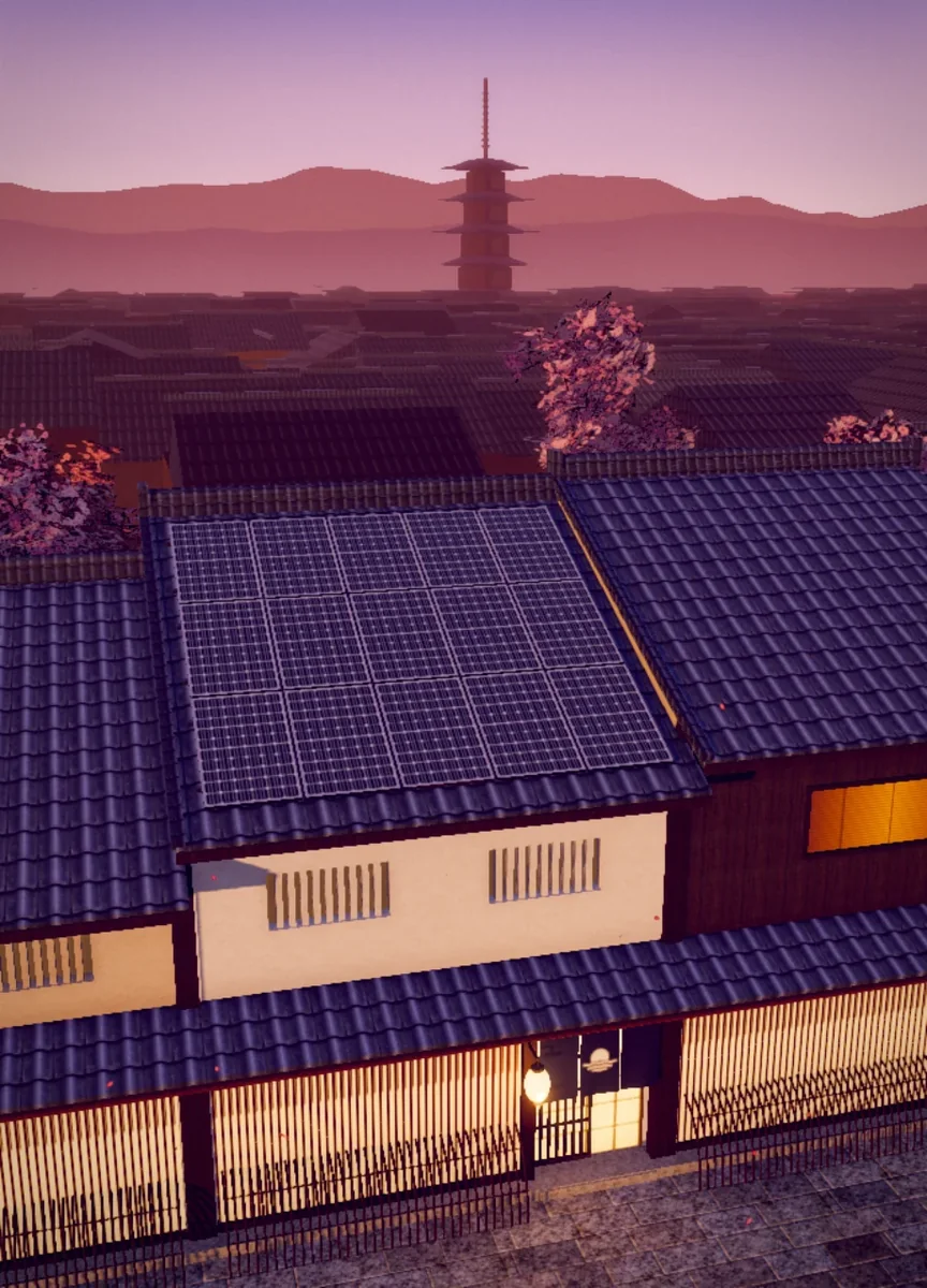
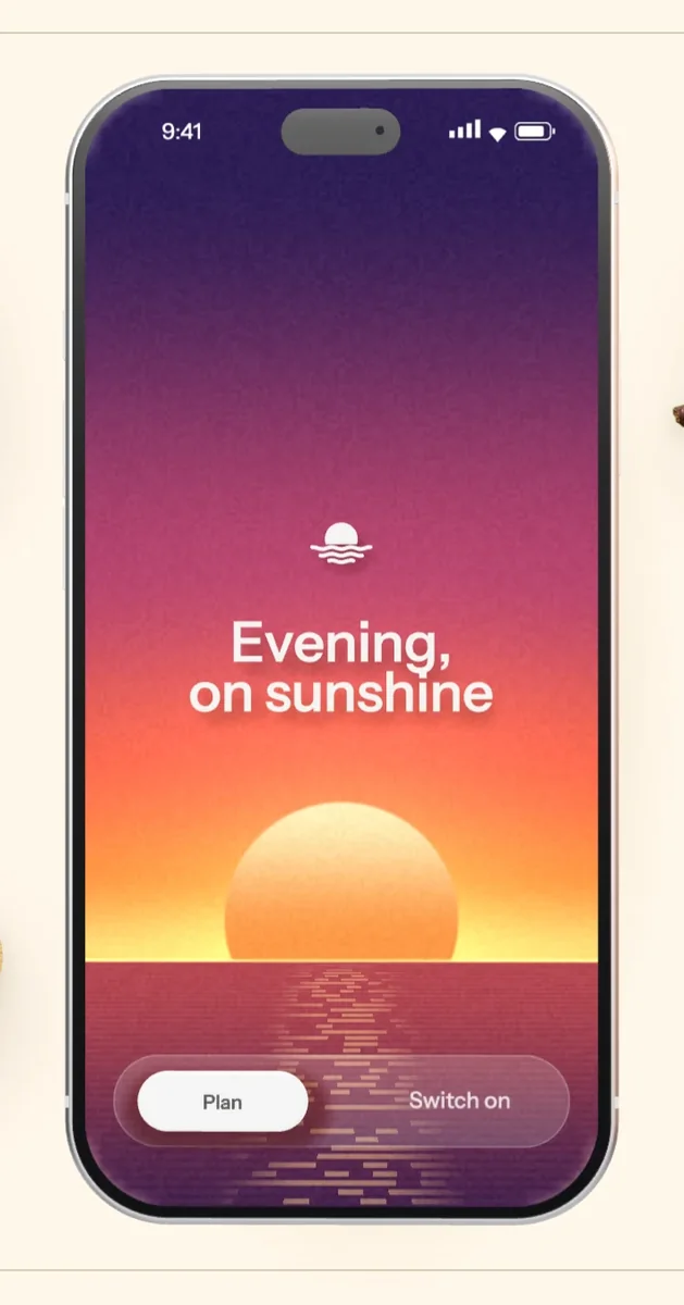
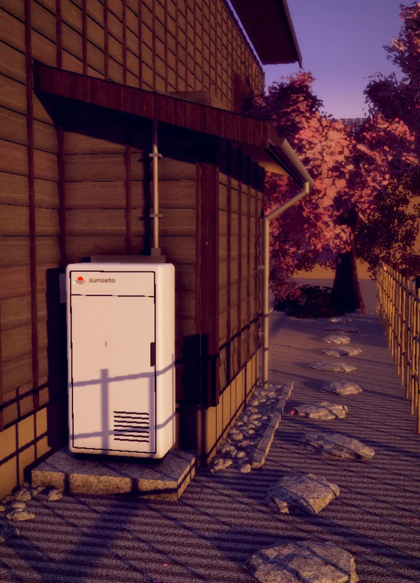
Step 1 · scenes in opposite corners
Each row of three holds one media tile, one text cell and one object cell, and they move one column to the right as you scroll, so the page walks down a diagonal.
In the step grids a phone or chart sits in the middle, two 3D scenes take opposite corners, and every empty square carries one note: a label, a figure, a sentence.
Each part below is live and built from the site’s own CSS, so hover it, drag it, press it. They sit flat and face-on. Only the chart tray has depth, because it is a thing on a desk.
Clear glass on a 16px radius. Its rim bends what passes behind it (an SVG lens, in Chromium), picks up light from the side nearest the cursor as a slab of glass would, and turns to dark glass over dark sections.
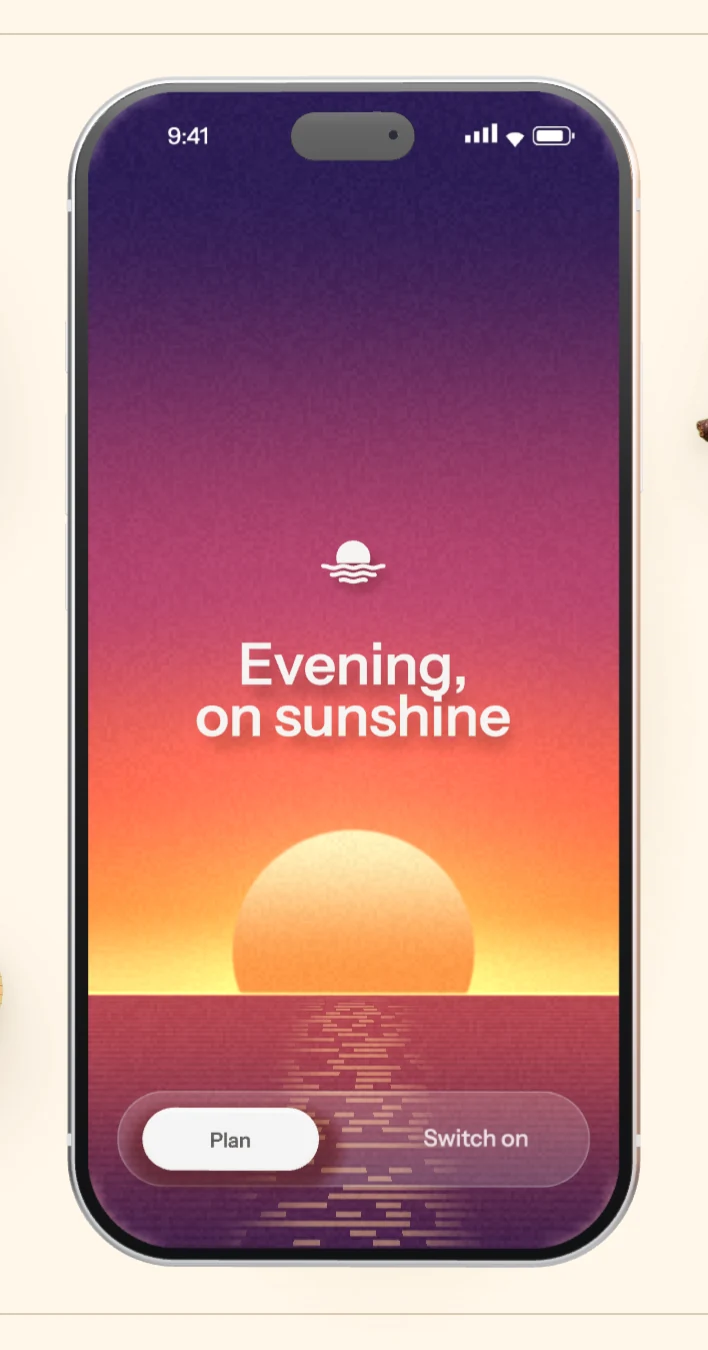
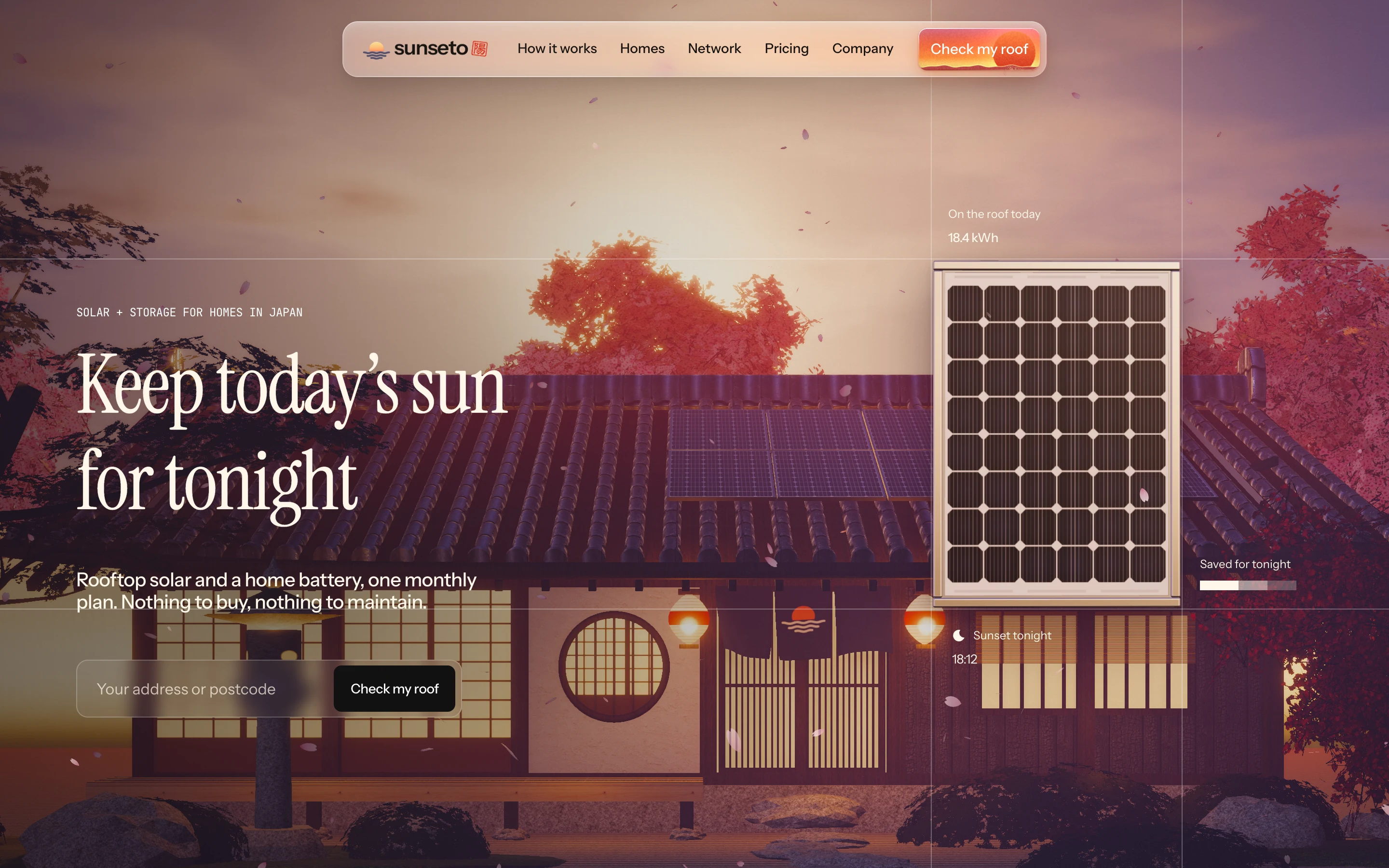
The brand’s own surface, rendered live: a woodblock sunset with the sun set behind the word “roof”. On hover the tide comes in on a damped spring, the sun sinks into it and a few sparks lift off the water.
On hover a paper panel rises from below at a slight turn and fills the button, and the label lifts 1px. On dark sections it is inverted.
Every heading is introduced by a short uppercase label in JetBrains Mono. It names the thing; it never explains it. Two to four words.
Panels, battery, fitting and upkeep in one price.
The battery takes over before a lamp can flicker.
The empty squares of a step grid each carry one figure, like a line in a ledger: a label, a large serif number with its unit, and one sentence.
NIPPON84Our machiya is a hundred and ten years old. The crew laid the panels into the kawara as if they had always been there.
Testimonials arrive as Japanese postcards: a perforated intaglio stamp, red postcode boxes, a round postmark that comes down once the card settles, and the sender’s seal beside the name.
The week’s chart as sheets of washi and vellum resting in a hinoki tray with masu-style butt joints and eased edges. It lies face-on; under the cursor it turns a little, and each side takes its shade from the key light.
Tell us who lives at home. We size the panels and the battery so the afternoon carries you into the night, and charge one monthly price for all of it.
Prices include tax. We confirm yours after we have looked at your roof.
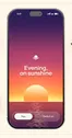
The slider steps 小 中 大 at one to two, three to four and five to six people. The card’s sky is the evening that plan’s battery covers: the sun sinks further, the print deepens to indigo and a crescent moon comes up the later it carries you.
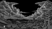
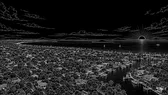
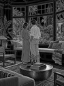
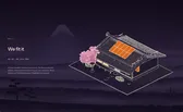
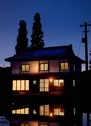
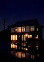
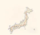
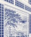
Four kinds of picture: white-line engravings lit by the sky behind them, paper objects floating in empty cells, intaglio stamps, and 3D tiles of real homes at the hour the battery takes over.
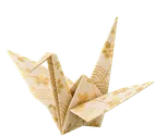
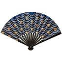
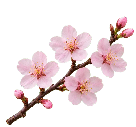
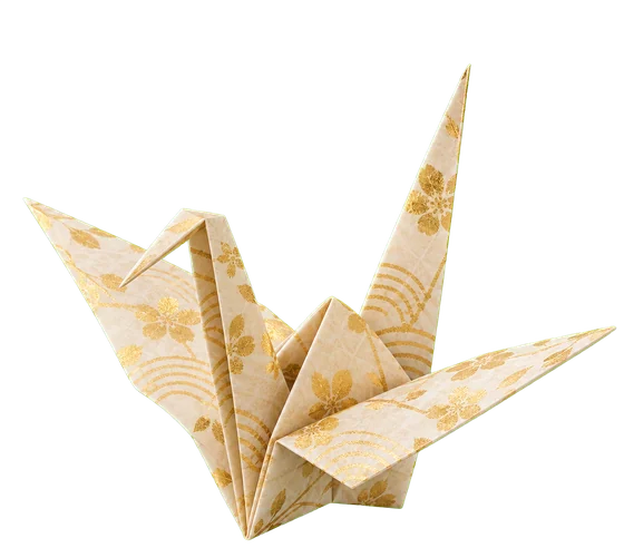
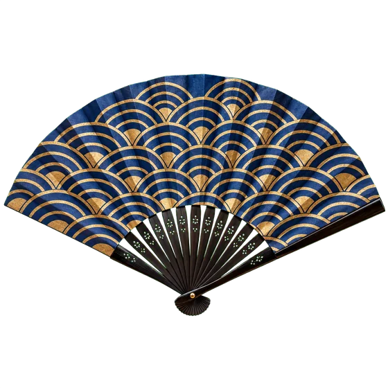
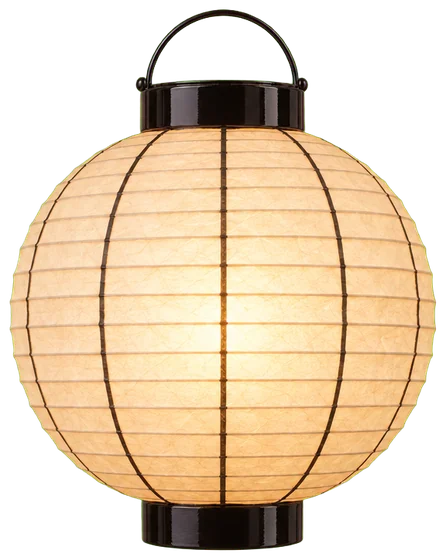 Orizuru · chōchinCrane, lanternSensuFanSakuraBlossom
Ornaments float in the empty cells of the grid and nowhere else. They carry a soft two-part shadow, drift on a seven- or nine-second breath, and never overlap type. They are keyed objects, photographed flat, so the page itself stays face-on.
NIPPON84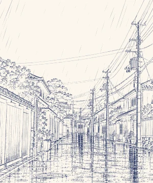 NIPPON84
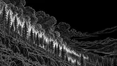
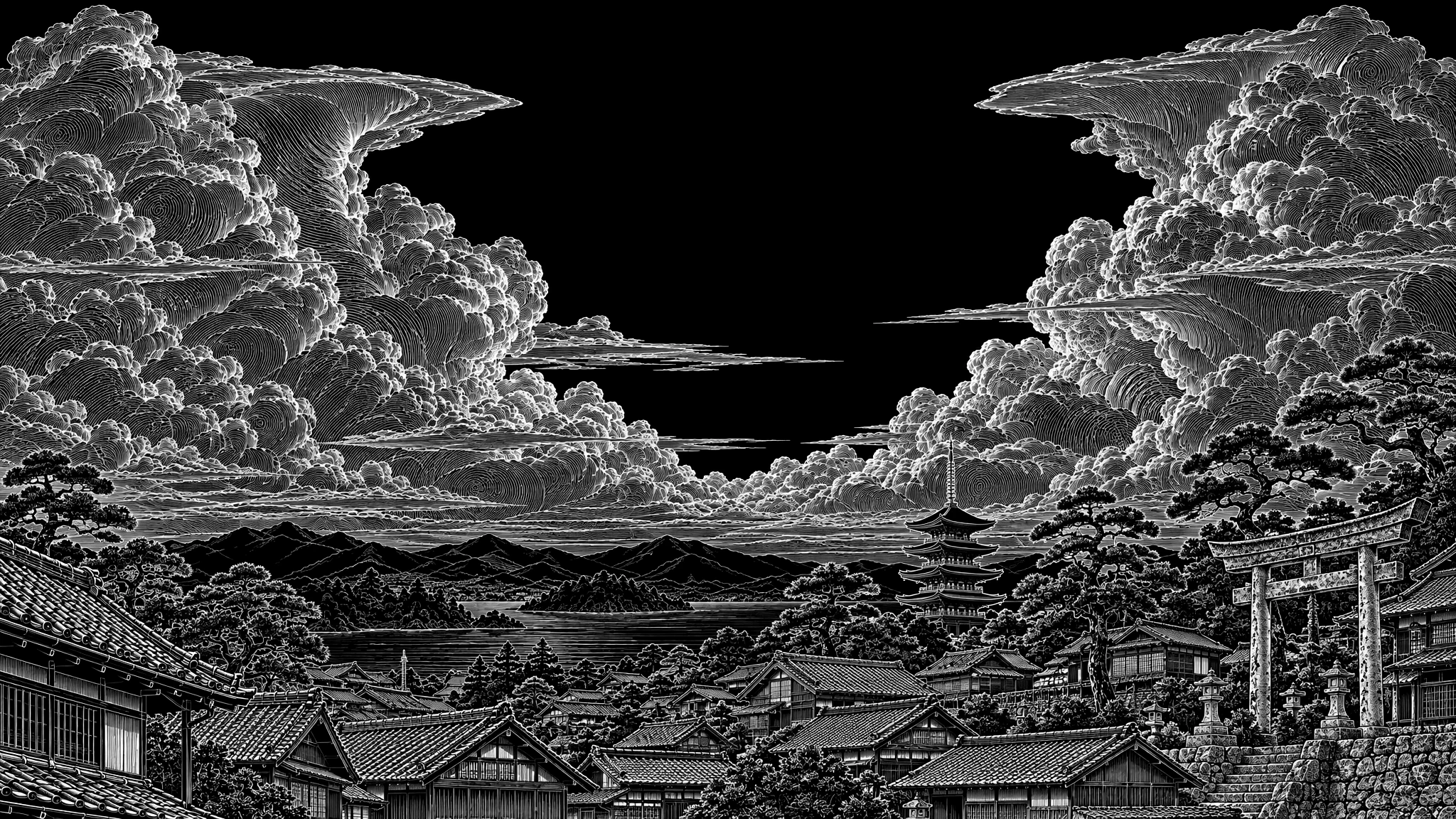
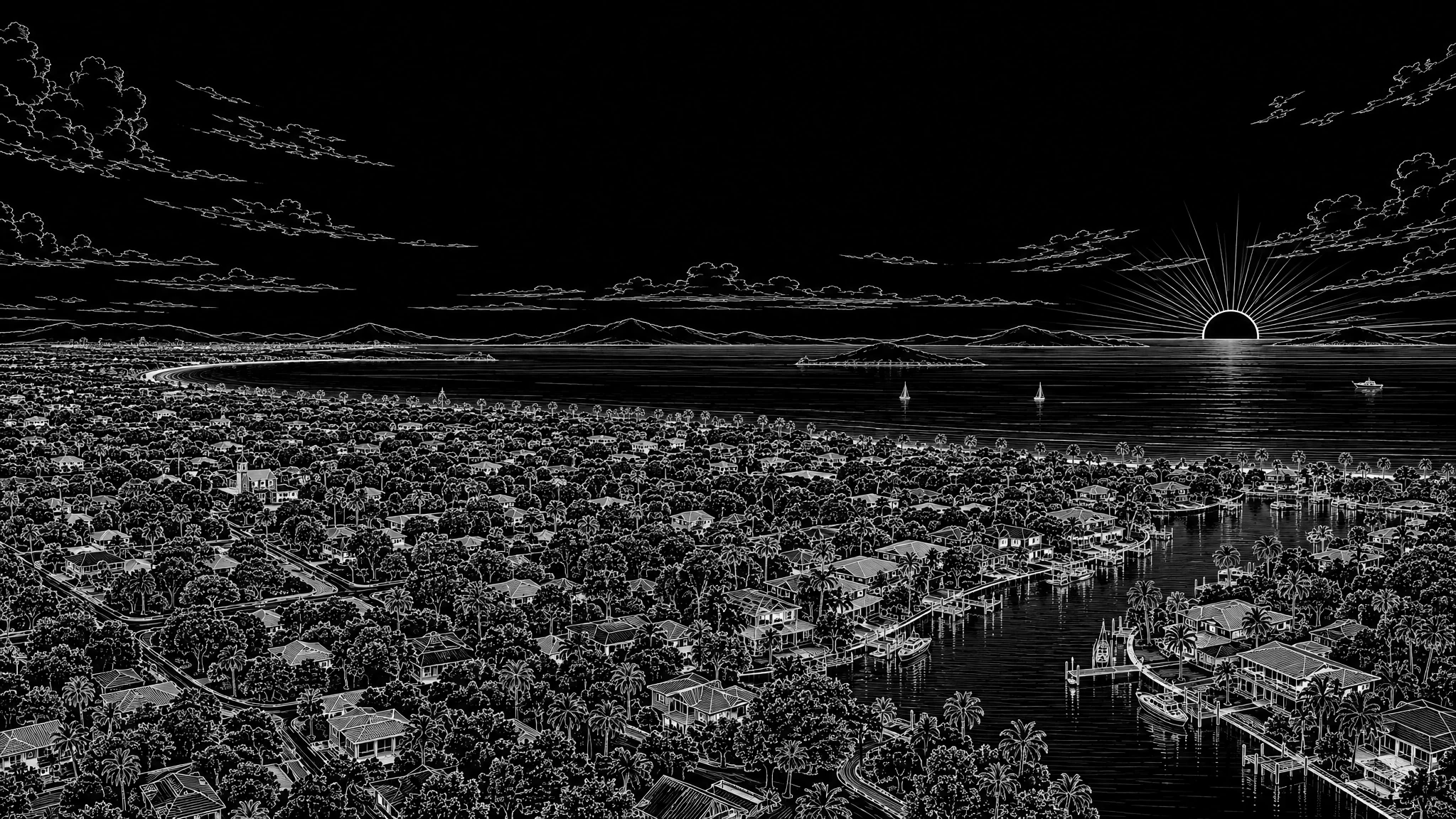
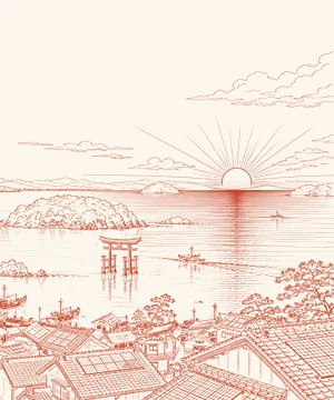 NIPPON84Roof by roof · w_jaerialScreen over the sky
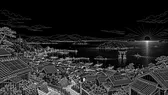
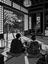
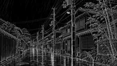
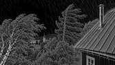
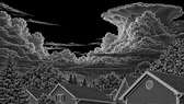
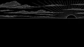
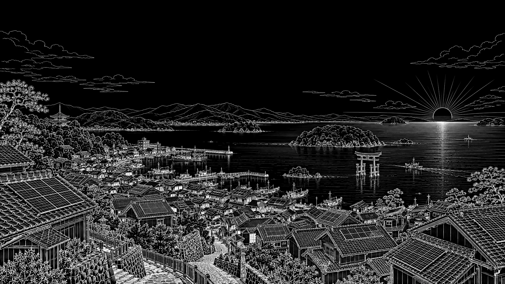
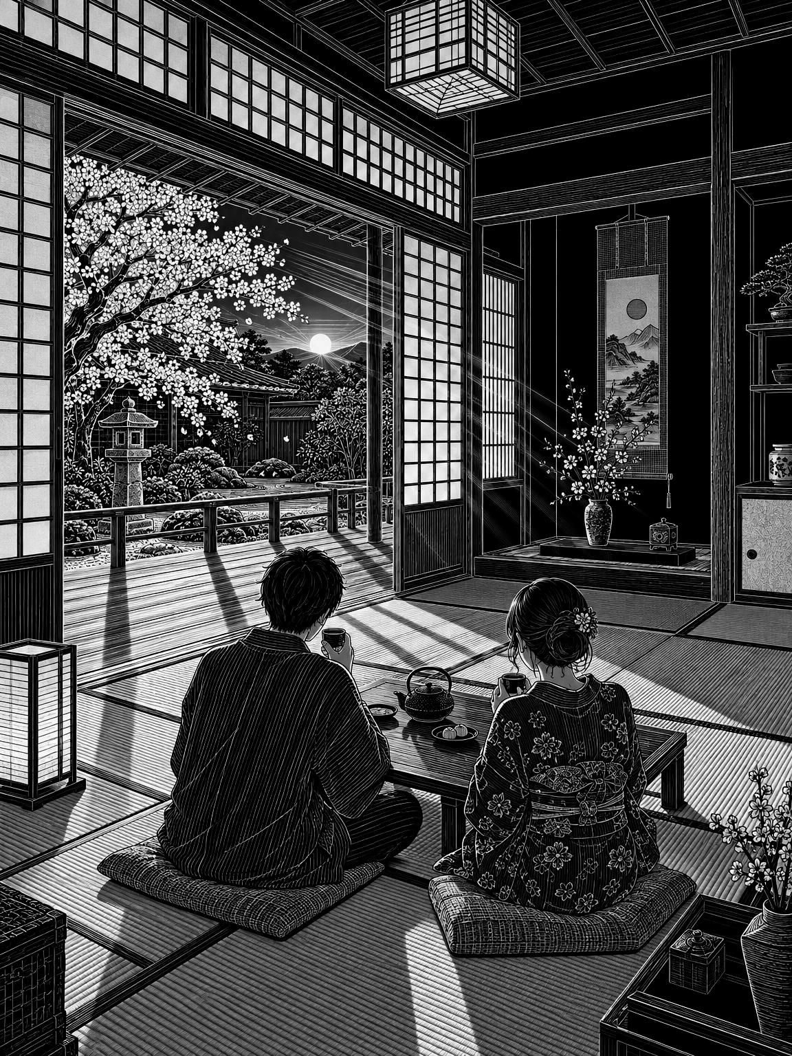
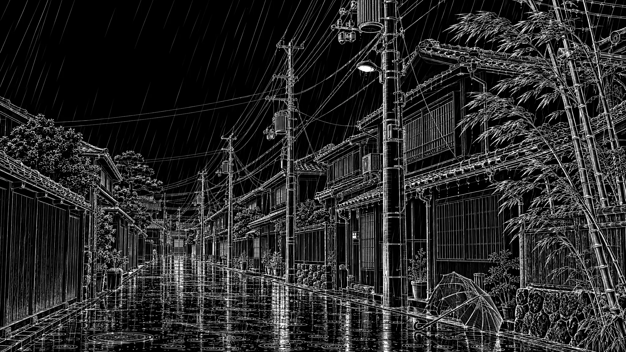
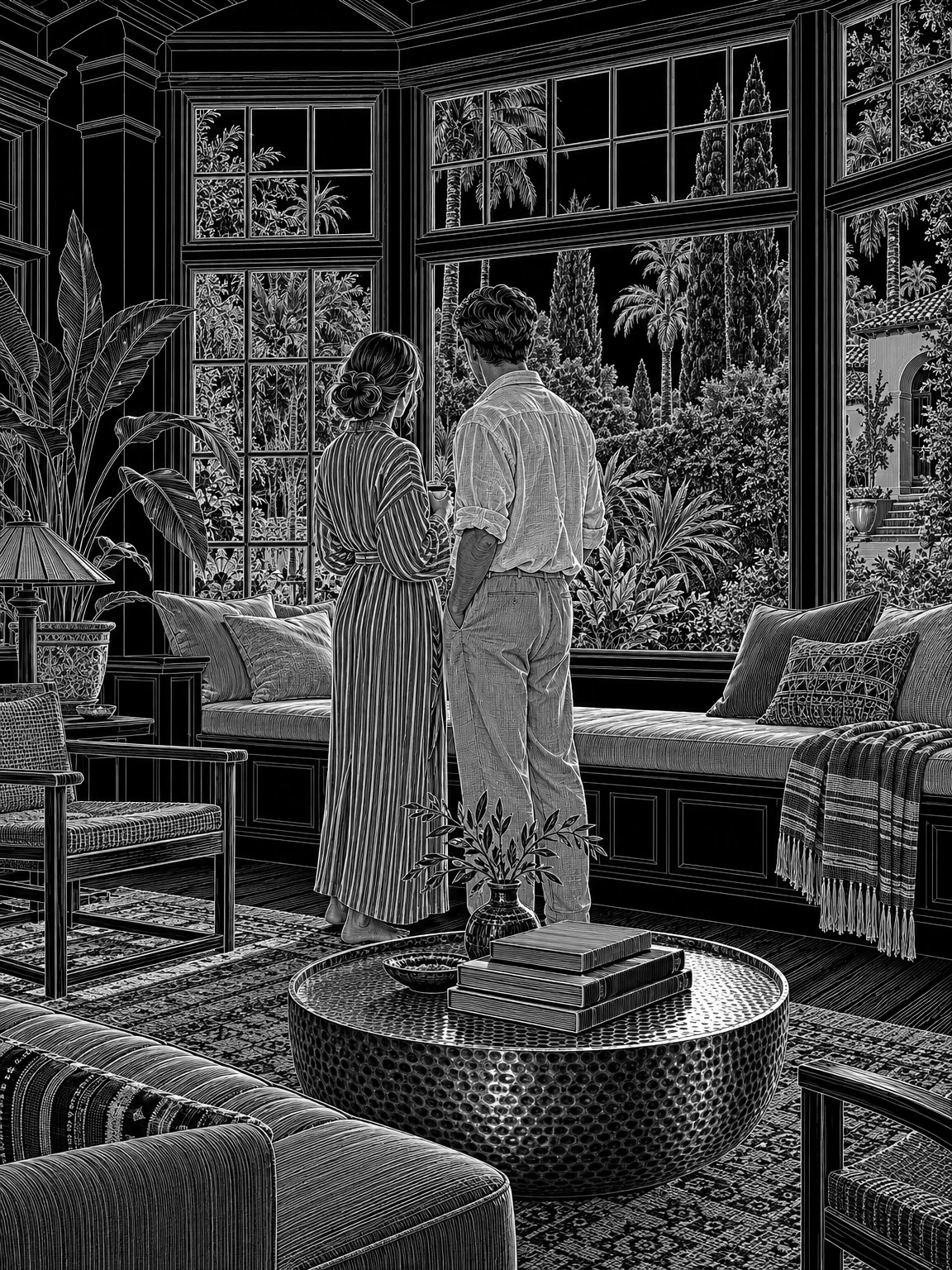
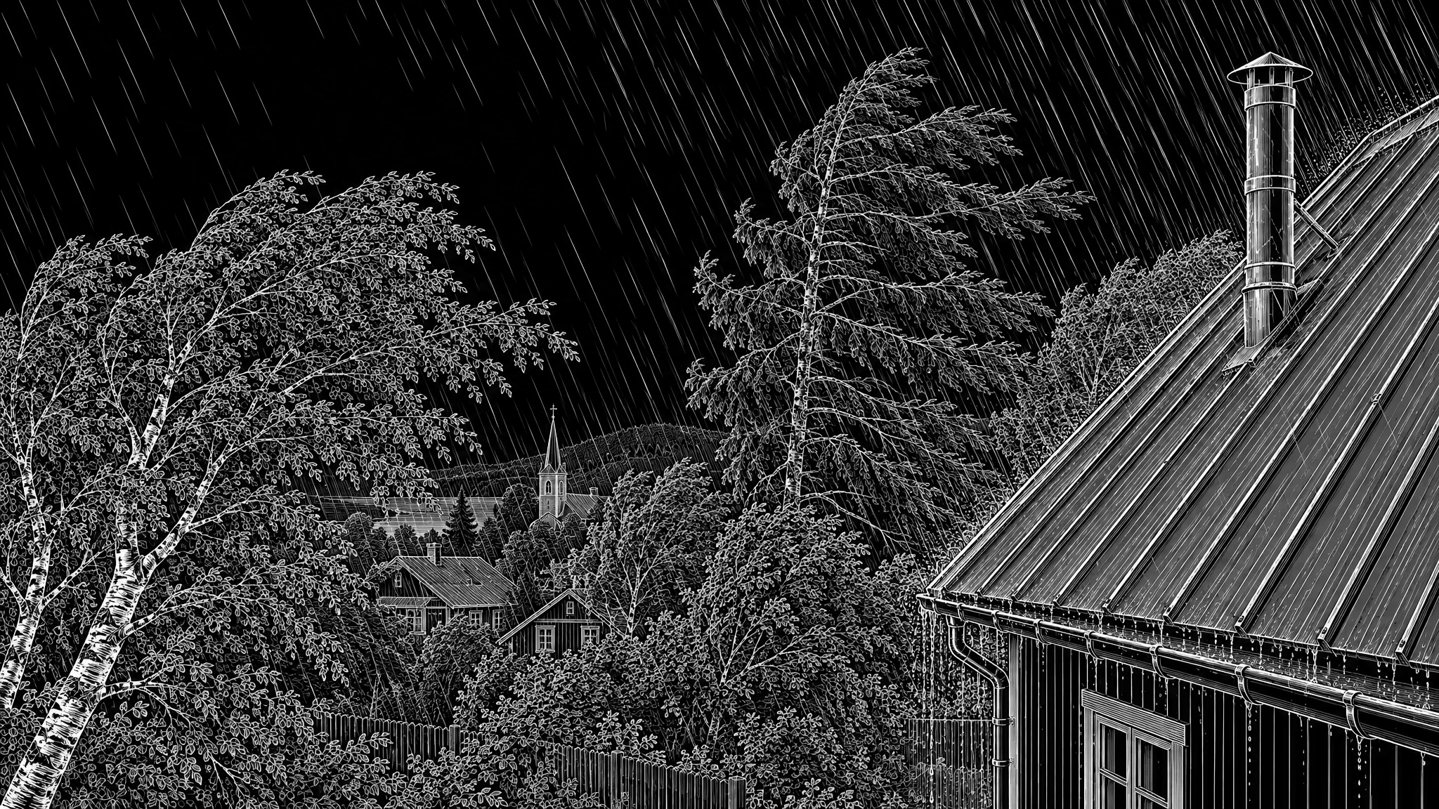
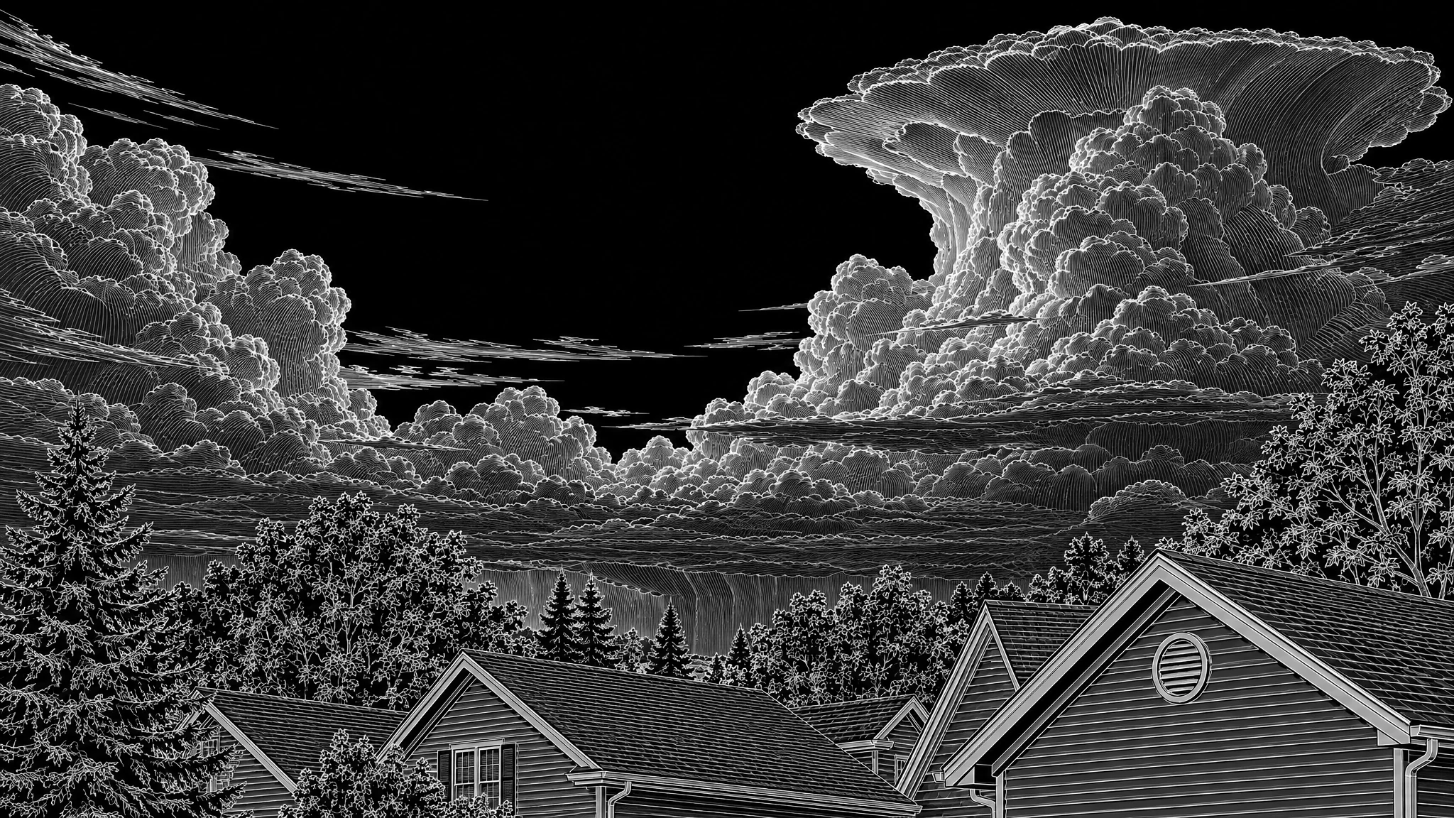
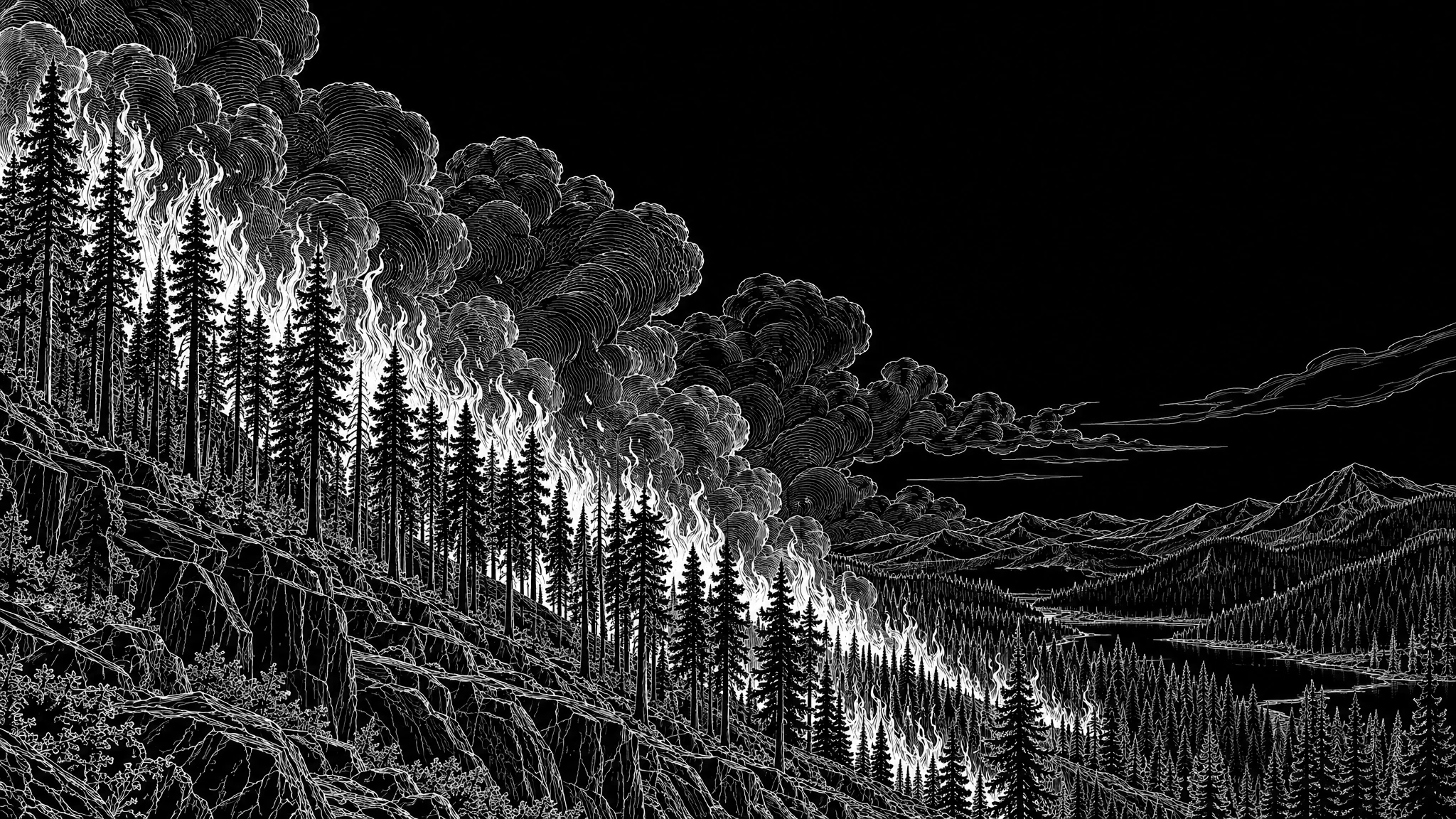
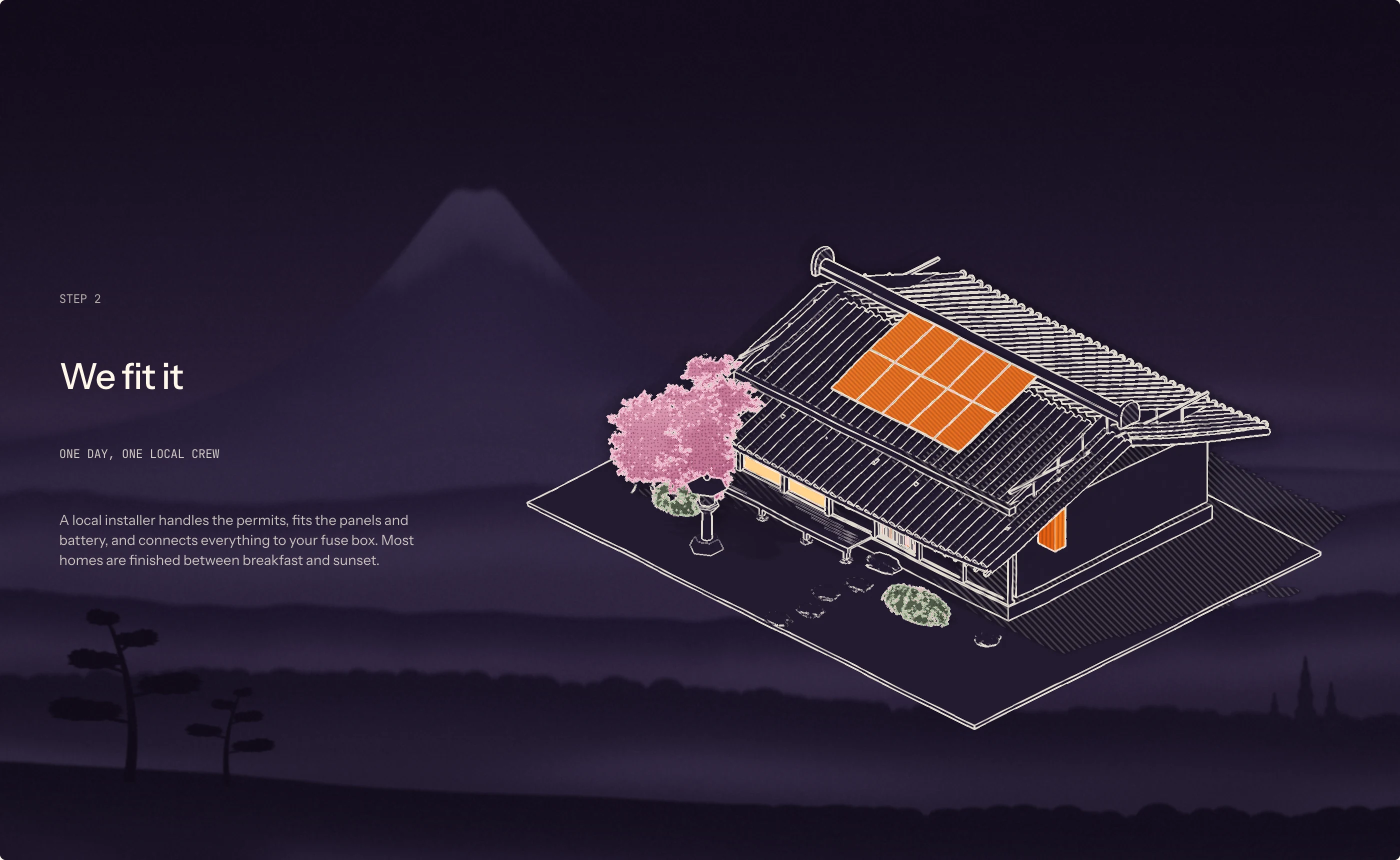
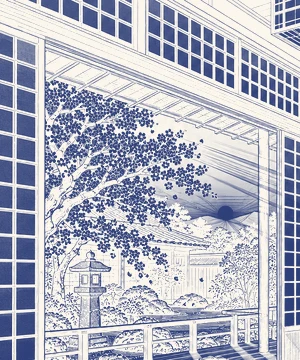
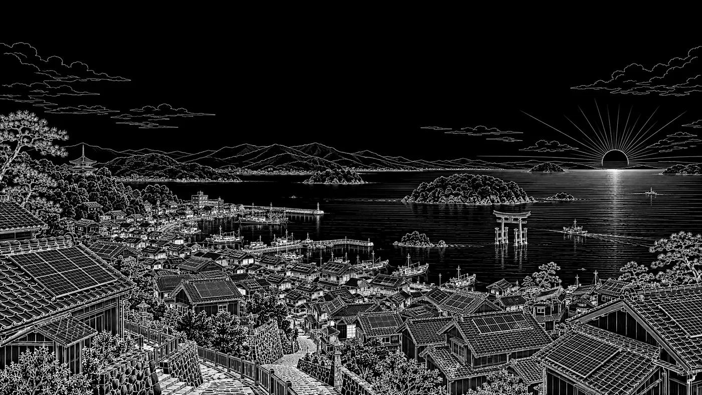
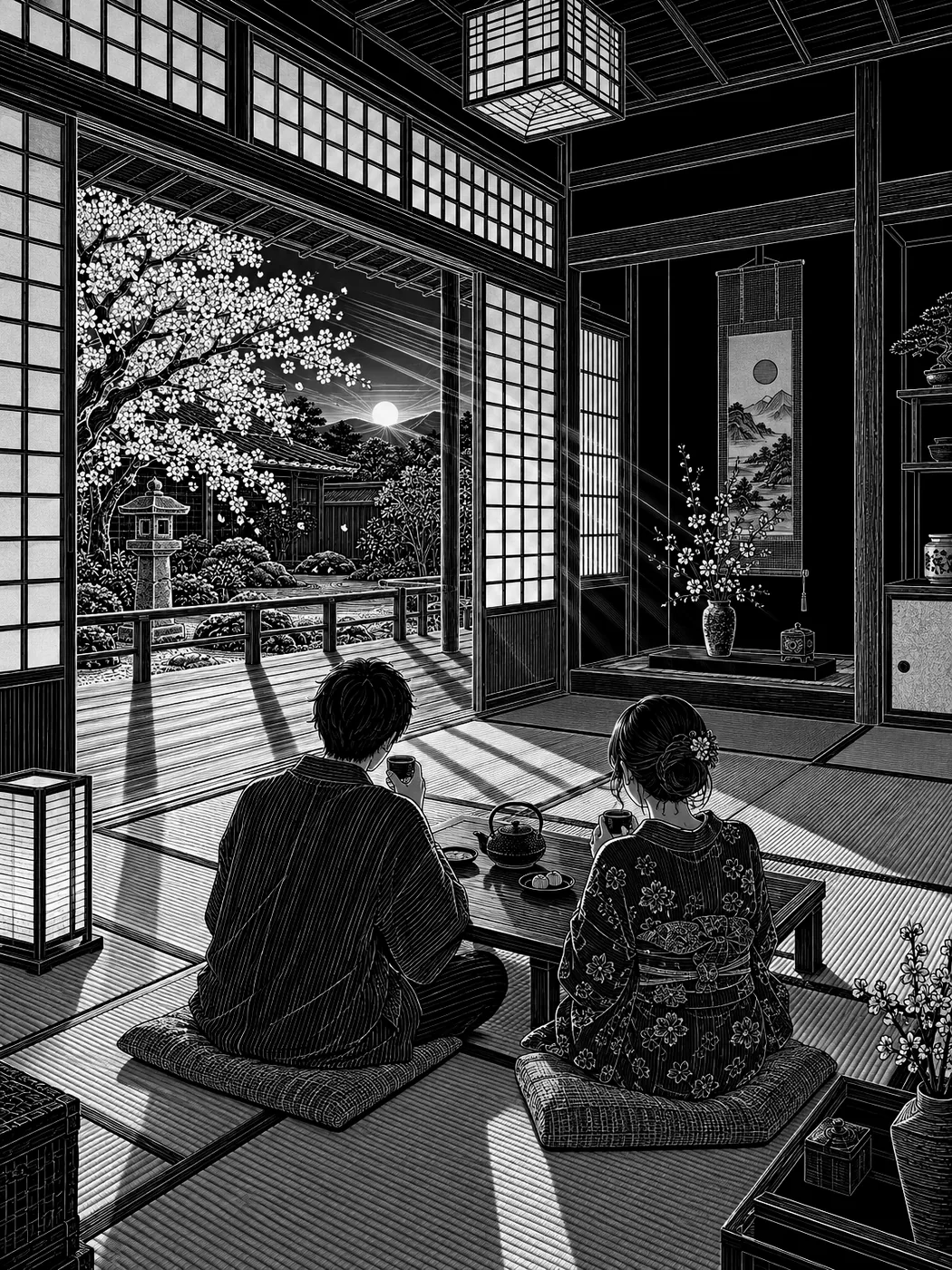
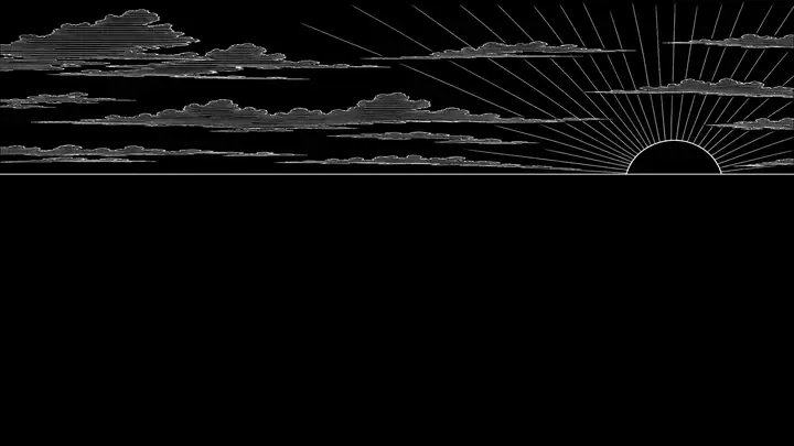
Each engraving is white line on black, like a scratchboard. On the page it is laid over a painted sky with mix-blend-mode: screen, so the black disappears and the lines take the colour of the evening behind them.
On the site they are split into sky, far and near layers that drift apart as you scroll. Keep the sky in the upper third and the sun where the drawing puts it.
Keep the eveningw_jliving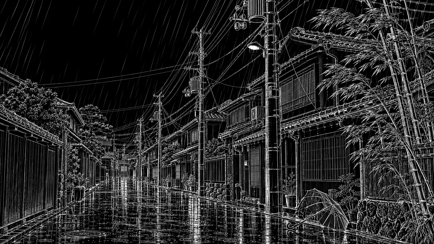 What we facew_jrain
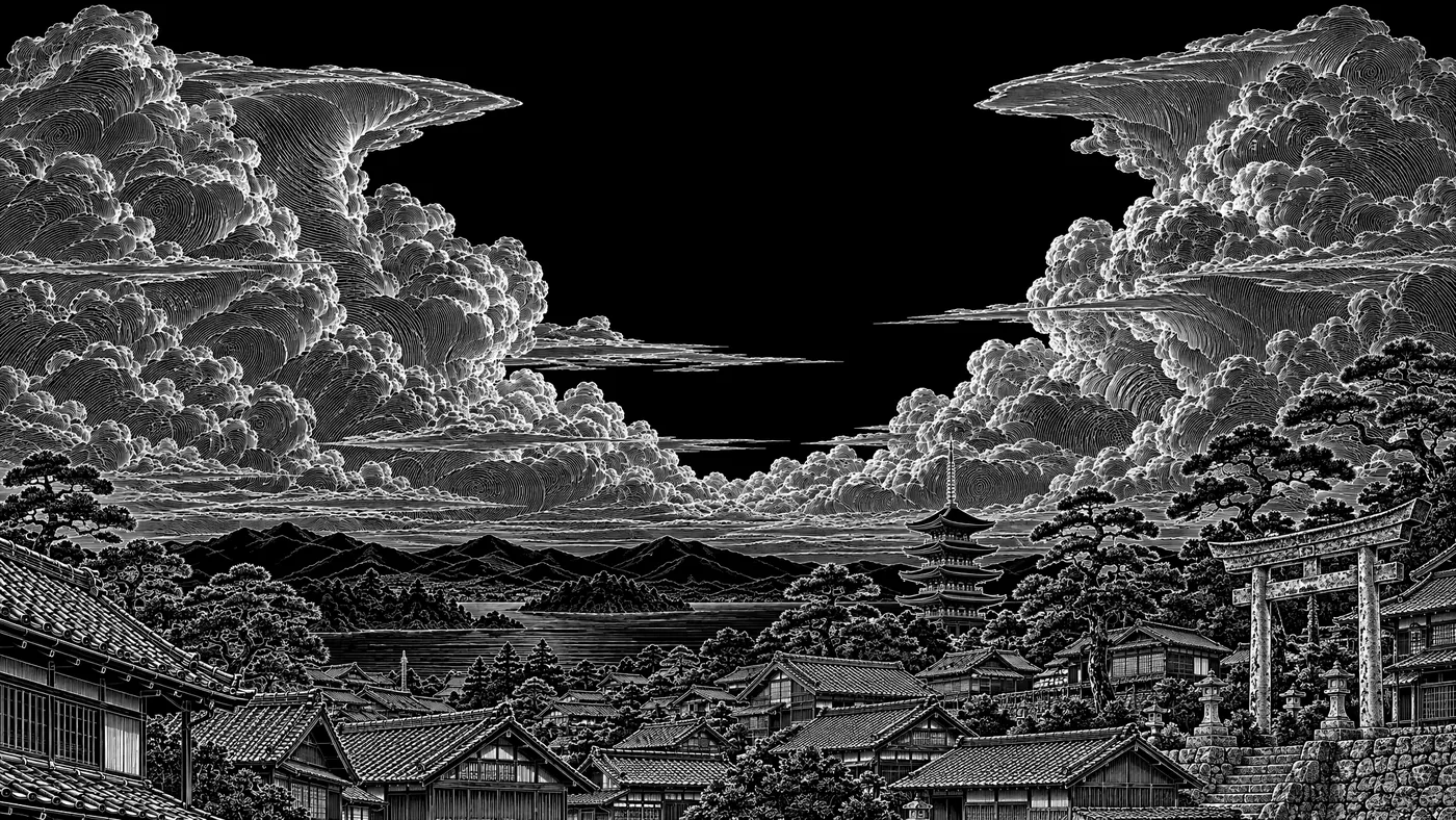 Why noww_jstorm
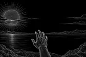
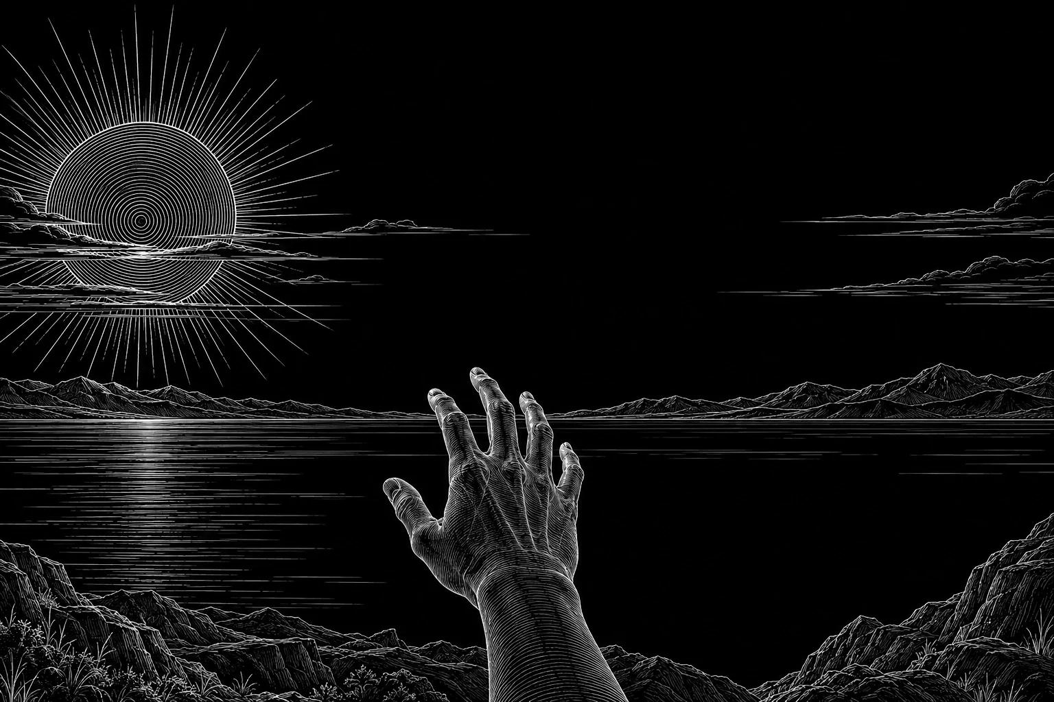
The How it works intro: a hand raised to the low sun over the sea. The most literal picture of the promise, used once.
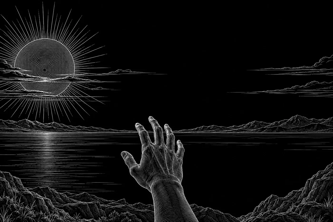 From roof to roomw_sunhand
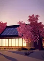
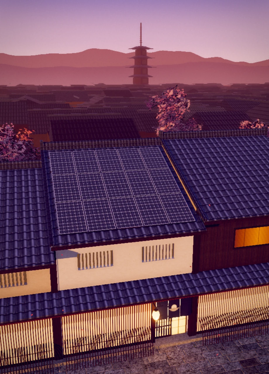
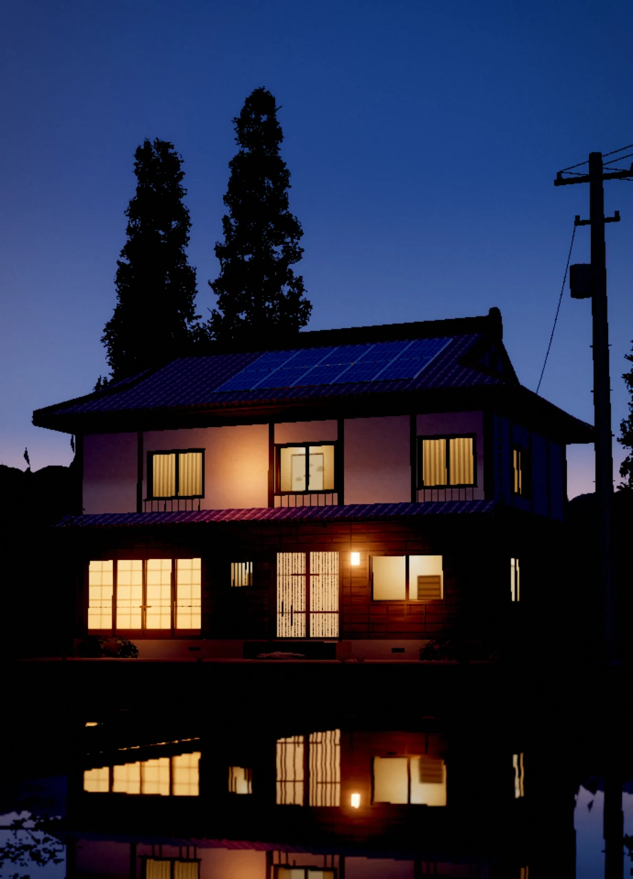
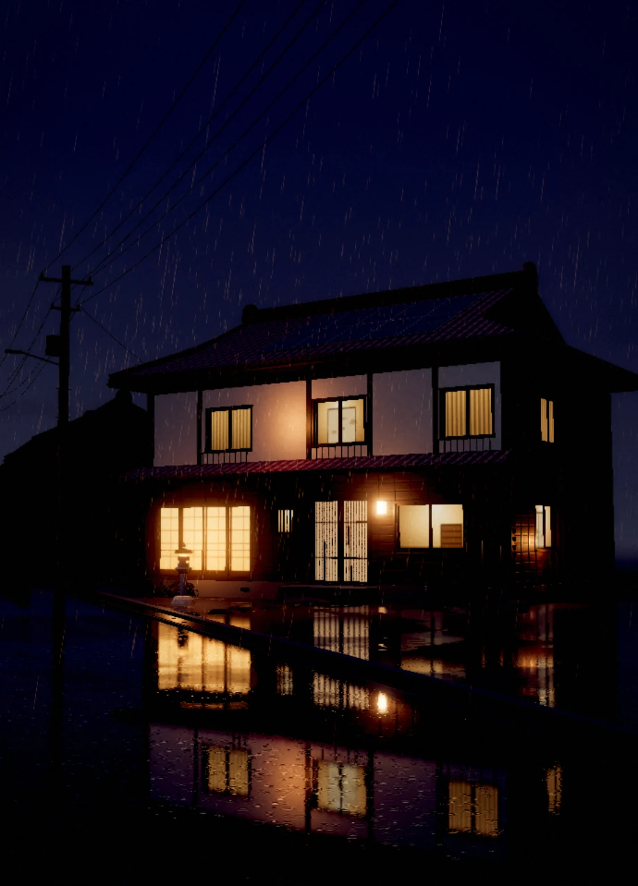
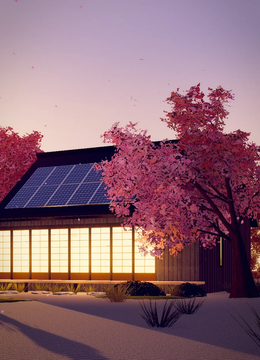
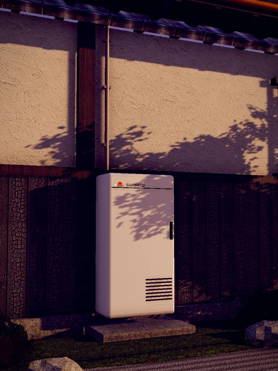
Each tile is a small three.js scene: a real kind of Japanese house, under a low sun, at dusk or in a storm. Everything rests on something. Nothing floats, nothing passes through anything else.
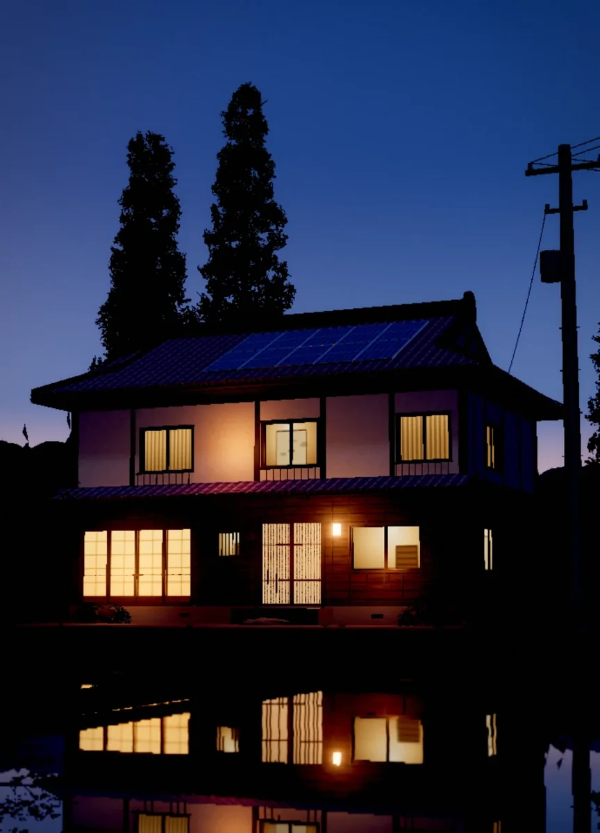
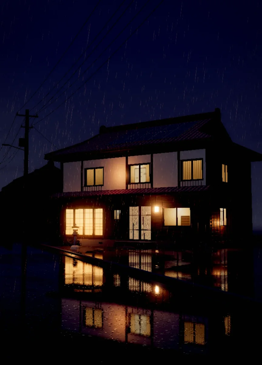
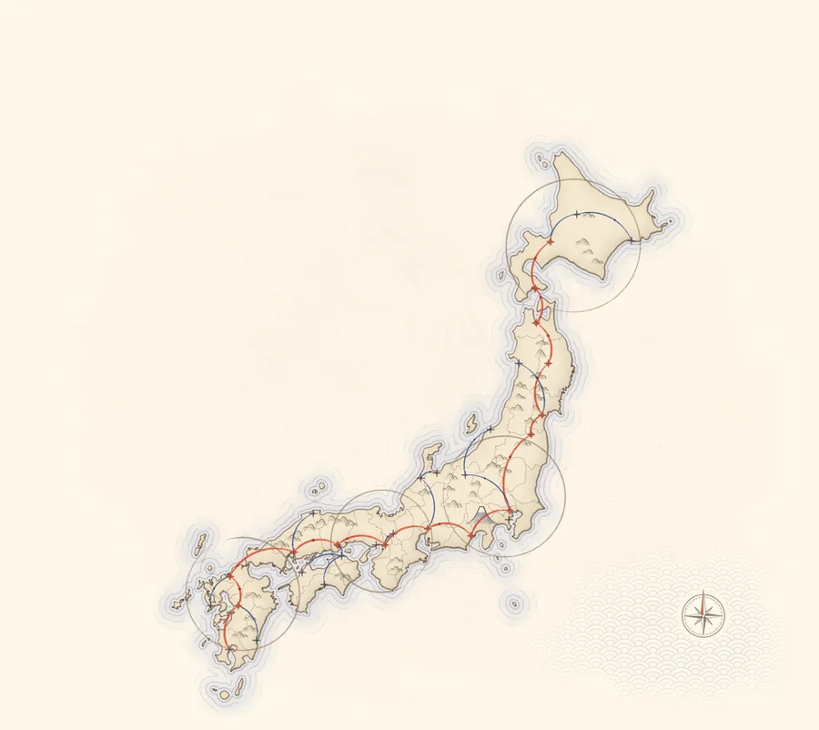
Scroll tells the story; time only moves small things. Most things cover their distance early and settle slowly, the way a sheet of paper lands on a table.
Big moves are tied to scroll position, so the reader sets the pace and can always go back: the heading hand-off, the chart drawing in, the phone forming from its icon.
A line of type, then the next, 90ms apart. A card settles, then its postmark comes down, then its seal. The eye always has one place to look.
With reduced motion, reveals stop, ornaments hold still and the stamp simply appears. Nothing important depends on movement.
1.2 s · cubic-bezier(.16, 1, .3, 1) · 90 ms stagger.sv, .rvopacity 1 s ease · rise 12 px in 1.2 s.fade.6 s panel · .5 s label · (.16, 1, .3, 1).btn.7 s · (.16, 1, .3, 1)header.35 s · (.2, .8, .2, 1).nav-pill1.15 s clip-path · (.77, 0, .175, 1)#loader.34 s · (.3, 1.4, .5, 1) · scale 1.35 → 1.hk-pm.3 s, .22 s after the postmark.hk-fromeased toward the plan at 3.2 / ssections.jsdamped spring, ω 11, ζ 0.62main.js14 px and ±1.5°, 7 s and 9 s, ease-in-out.orninOutCubic, in three beats over the middle 56% of the scrolldom.jsUI answers in .3 to .6 seconds. Reveals take 1.2 seconds but are readable after the first third. Nothing loops fast; the slowest things, ornaments and the print’s clouds, move over seconds or minutes.
As the line between two rows crosses the middle of the screen, the letters the next heading shares with this one close up into a short line, cross the grid together and open out into their new places. The rest fade out and in; only one heading shows at rest.
Each line sits in its own mask and rises 105% of its height as it comes into view, 90ms after the line above.
NIPPON84A larger battery carries the evening further, so the sky on the card follows it: the sun half set at half past nine, under the sea by midnight, a crescent moon by four. The sky eases there over about a second.
Each household size maps to an hour and a depth of night. The shader turns that depth into three things: how far the sun has set, how far the print has deepened toward indigo, and how high the moon is.
We write in UK English, the way a good neighbour talks over the fence: short sentences, real numbers, no jargon. We promise one thing, the evening, and we say it simply.
“Keep today’s sun for tonight.”The promise · hero
“Most homes are finished between breakfast and sunset.”Step 2 · We fit it
“Pay for sunshine, not for fuel ships.”Homes · Spend less
“When the grid goes down, your house simply carries on.”Step 3 · Switch on
“Our lamps never flickered, so the neighbours came round for tea.”A letter from Tateyama
Six rules that hold across the site, the app and anything else that carries the name. If a detail breaks one of them, the detail goes.
Polish comes from the drawing, the material and the light already in the scene, never from a highlight laid on top. If something feels flat, fix the lighting or the motion.
Screens, cards and panels are true rectangles with their edges parallel to the page. Depth belongs to floating decorative objects: the crane, the lantern, the app icon.
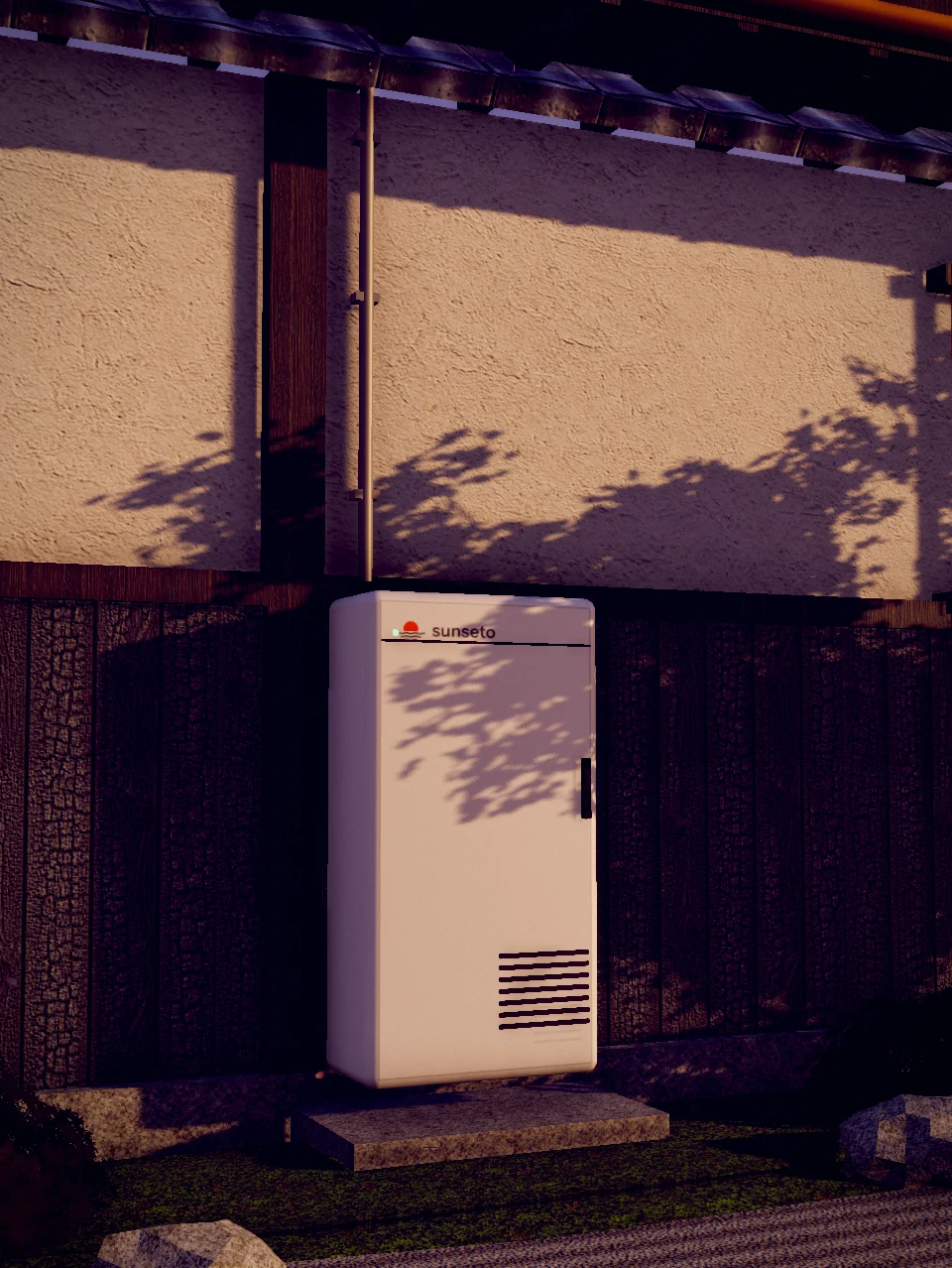
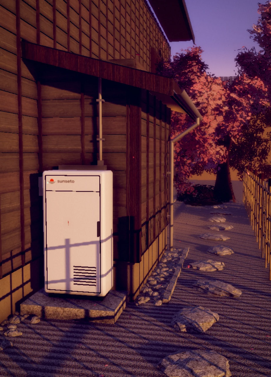
In the 3D scenes every object meets what holds it, with a contact shadow where they touch: panels on the kawara, the battery on its plinth, lanterns on their cords. Moving parts keep clear of each other.
On any screen, at any width. Wrap fluid sizes in max(11px, …) and check text drawn inside SVGs against the box it lands in.
Structure is drawn with single 1px rules in the rule colour. No boxed cards inside boxes, no double borders, no drop shadows on flat UI.
Postcode boxes on a postcard, a hanko on the chart, kawara under the panels, masu joints in a tray. Reach for the real object before the generic icon; our sun has waves, not rays.
Every file in this guide, grouped as the chapters are. Take the whole kit as one archive, or single files below.
Download the kit · 10.2 MB